
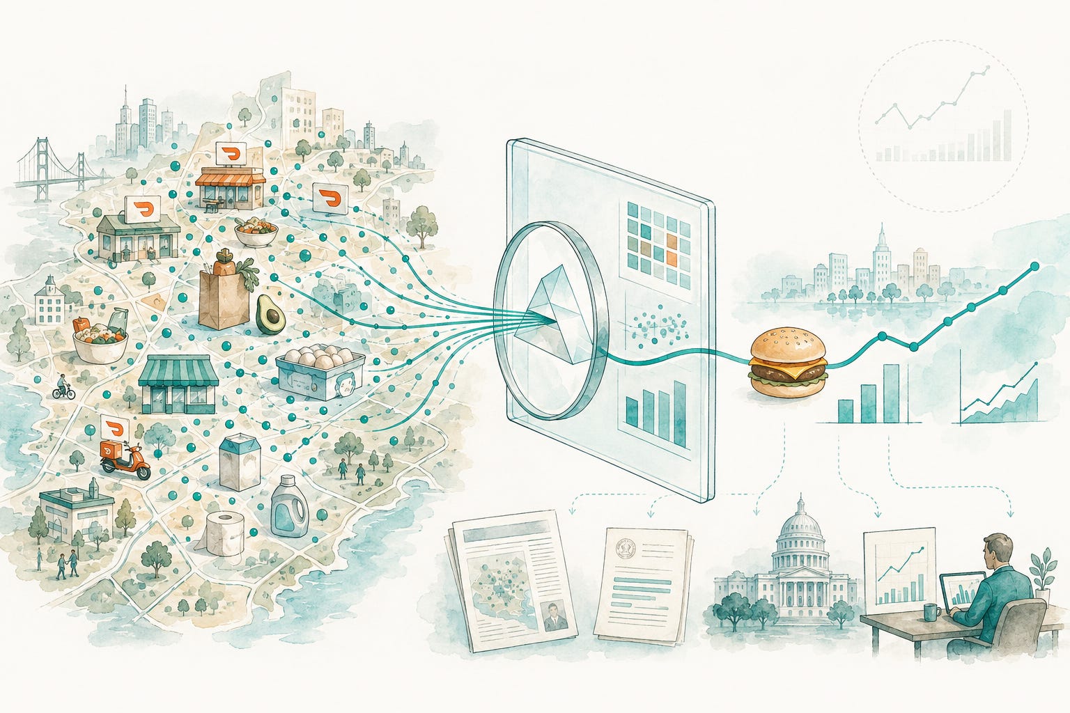
A couple of years ago, our team was asked a question that sounds simple but is very hard to answer: What is actually happening in local economies?
Not the national average. Not survey-based data that comes out on a lag. But what are people actually buying, at what price, in which neighborhoods, in real time, and how is that changing?
DoorDash has a unique lens into that question. Every day, people use our platform to buy meals, groceries, household goods, and everyday essentials across thousands of cities. That gives us a view into local commerce that is both broad and highly granular.
But having the data is not the same thing as knowing what to do with it.
The harder work was deciding which questions were worth asking, how to answer them consistently, and how to build something useful enough for researchers, policymakers, journalists, and local leaders to actually use.
That’s the work my team has been doing.
More specifically, this work has been led by Abhi, Anita, Cheryl, and Eli, with many others across the Analytics team contributing quarter after quarter to shape the methodology, pressure-test the findings, and turn the data into something people outside DoorDash can actually use.
One of the things I’ve always believed about great analytics teams is that the best ones don’t just answer the questions they’re given. They have a point of view on which questions matter.
The Cheeseburger Index is a good example.
It came out of a discussion about how to create a simple, intuitive proxy for local restaurant pricing. Something that could make price differences easier to understand. Something a journalist, a policymaker, or a curious person in Lincoln, Nebraska could look at and immediately grasp.
That is often what good analytics looks like. It’s not always about finding the most sophisticated answer, but finding the clearest one.
Here’s what the Q2 data shows:
Everyday essentials remain essentially flat this quarter, with the range of household goods down just 0.6% overall compared to Q1 2026 across all categories. The largest mover in that category is diapers, down 2.4% this quarter.
Some grocery prices have recently started climbing, even as the broader grocery basket remains below year-ago levels. Egg prices helped drive prices down substantially in Q1 2026, but this quarter avocado and milk prices are back up by 12.4% and 8.3%, respectively.
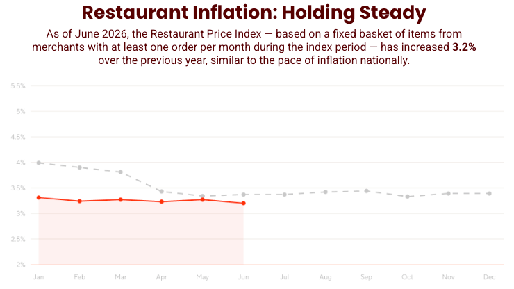
The Restaurant Price Index and Cheeseburger Index both continued to rise at the pace of inflation, up 3.2% from this time last year, even though the underlying cost of a cheeseburger’s ingredients rose just 0.6%. This points to broader operating-cost pressures — energy, rent, and other overhead — as the likely driver of restaurant inflation, rather than commodity food prices.
One of my favorite parts of this project is exploring the city-level data.
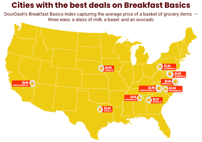
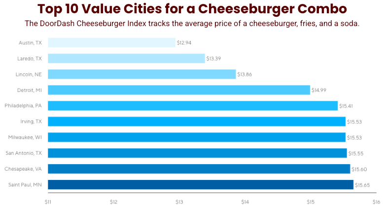
There’s something genuinely fun about pulling up the rankings and seeing where different cities land, and how often they defy expectations. Take Austin, for example: while many people think of it as a city that’s getting more and more expensive, it ranked #1 on our Cheeseburger Index for affordability this quarter. As someone who has enjoyed meals at Whataburger and Hopdoddy Burger Bar, I know a great burger meal can be found there, and the data shows it.
The local variation is real, and it’s bigger than most people assume. Once you start looking at it city by city, the national average stops being very interesting. I’ve always preferred looking at the distribution over focusing on an average.
We’re still building. There are questions we want to answer that we can’t yet. There are categories we want to add. There are new ways to make this data useful to the people studying local economies and making decisions in their communities.
But I am proud of what the team has built so far.
The State of Local Commerce report is not just a data release. It is an example of the kind of work I think great analytics teams should do: take messy, complex, highly local data and turn it into something people can understand, trust, and use.
If you are a researcher, policymaker, journalist, or local leader using this data, I would love to hear what is useful, what is missing, and what you wish we could answer next.
The full Q2 dataset and city-level breakdowns are at: https://about.doordash.com/en-us/state-of-local-commerce